
Break the Rules
Where did you learn to prepare a presentation slide deck?
If you're like me you learned by example rather than a formal class. Fact is, most classes are focused on the technology of using the software rather than placing the software in a context for design and development. And then there are the RULES. sigh. For starters,
- Do you start preparing your slides by opening the software e.g., PowerPoint, Keynote etc?
- Do you use the standard templates?
- Do you use bullet points?
- Do you use the built-in clip art?
- Are your slides more for your benefit than your participants?
- Are you printing your slides for use as a handout?
If you answered YES to any of these questions then its time to break some rules!

Here's the deal.
Back in the day when we first had software to create slides for our workshops, trainings, and presentations, computer storage was very expensive, words took up less space so the software was designed with words in mind. There was a small clip art library but no high definition images! Now we have remarkably cheap storage including flash drives of upwards of 128 GB (not MB) of space. We can make and take large files with us anywhere ... even on our smartphones!
We've also learned about how people learn and those old slide rules are actually detrimental to learning. Here's how.
1. Consistent is actually boring to the brain. (Freeman & Freeman, 2006, Howard, 2006). We are encouraged to be consistent with our slides when what we need is the element of novelty and surprise. See, our brains are natural pattern finders and once the brain recognizes the pattern it thinks it already knows what's coming next so attention falters. I'm betting right now you can see the template pattern in your head, right? Each slide follows a similar pattern e.g., a header with a box of bullet points. Can you see the problem with those "consistent" templates?
2. Visuals work best. We've also learned from the brain science that our brain loves visuals and that visuals are the quickest communicators of ideas or concepts. Bottom line, our vision trumps our other senses (Medina, 2008, Reynolds, 2008, Clark/Kwinn, 2007). In the old days, pictures took up way too much room so we didn't use them. Now we have the capacity to use them but we're often stuck in the old rules. The good news is, we can change.
3. Another big thing that has changed is social media. It is new enough that we're most often unprepared to integrate it into our presentation practices. We now have the ability to extend our learning conversations well outside our conference or training room using social media (Atkinson, 2009, Mansfield, 2011). We also have amazing social media tools to help us engage using social media and yet few presenters take advantage of this powerful aspect of communications. When's the last time you were in a conference workshop or training room and were told, "keep your mobile devices on and USE them during the workshop"?
4. How often do you place a Call to Action at the end of your workshop presentation? One of the things I learned from social media is to "ask" for the action I'm aiming for. That's a call to action. What is it you aim for your participants (formerly called the audience) to do as a result of what they've learned? You can help them by making it clear (connecting the dots) rather than assuming they know what to do next. (Duarte, 2008)
5. About those handouts?! I know how much we love the fact we can use our slides as handouts. It may save time but because of how we learn we're now asking, at what expense to the participant? The bottom line is slides and handouts have very different purposes (Duarte, 2014) so substituting one for the other is a losing proposition. A handout is designed to be read, its informative, content-focused and even great for that bulleted list that doesn't work well on your slides. On the other hand, slides are presenter focused, support the message, tell a visual story and meant to be consumed as part of a live performance. Whether a simple one-page synopsis of key points or a step-by-step workbook, be as intentional with the handouts as you are with your slides.
These five are a good start toward making your slide decks really rock your participants' world -- to be useful, supportive and helpful when it comes to learning the content you aim to teach. The slide deck isn't the only element but it is a good foundational element to do well in support of the learners.
There's more.
After my wake up call for developing wicked great slides, I began to study everything I could get my hands on to help me understand how to create slide decks that really facilitated the learning process. I studied brain science, learning research, and design patterns. Every slide deck I prepared became a testing ground for refining, adjusting and strengthening. That was 2008.
With practice came confidence and courage. After a couple of years I began teaching what I was learning and at one time was listed in the top 3% most viewed content on slideshare.net. What an honor and what a learning journey. Then I decided to take what I'd learned and create a practical guide for those doing training, workshops, and presentations sharing what I'd learned so you/they wouldn't have to start where I did with the research, testing and refining.
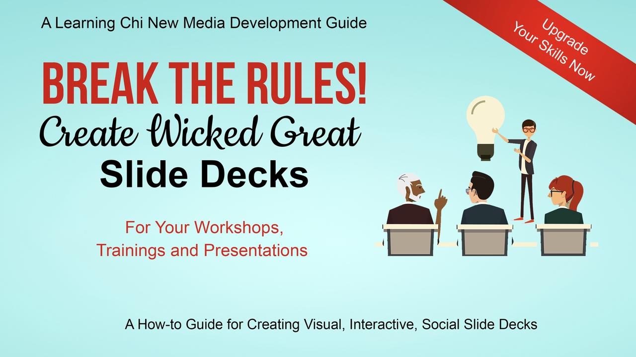
I finally came up with a 120-page Guide titled,
Break the Rules! Create Wicked Great Slide Decks for your Workshops, Trainings and Presentations.
The goal was and is for this guide to support you in designing and developing visual, interactive and social slide decks.
In the Guide you get:
- Why learn new ways?
- A practical framework for design and development from thought to post-workshop engagement including context, content, visuals, interactivity and the many technical things you can do to bring it all together.
- Three methods for developing your ideas before you ever open your software.
- Identifying and focusing on your purpose for your slides
- A set of questions to help establish context.
- The technical aspects of working with your slides from color, font and aspect ratio to creating your own unique templates, using pictures and selecting ideal fonts. There's even some help for those who must use a branded organizational template.
- How to use visuals to communicate your content and have a greater impact. There are sources for photos, video, and audio from no-cost to low-cost. Then there's file compression, screen captures, and the three ways to include video within your slides not to mention building animations that work.
- Creative Commons license your work.
- Ways to engage your participants from music to purposeful interaction points, polling to table talk and the all-important "harvest".
- Social media and how to use it as a backchannel and then bring it to the forefront, integrating into the learning experience.
- The presenter's unpardonable sin.
- How to use social media, what it looks like, sounds like to use social tools in your workshop or training setting.
- What to do in terms of saving your work before you hit the road (backing up backups)
- A bundle of resources and tools for you to select from to do what you intend to do with your audience.
- Practical activities and exercises to bring home the practices.
I hope you enjoy learning about and making wicked great slides as much as I do!