
5 Fundamental Secrets to More Effective PowerPoint Slide Decks
Jul 19, 2016
How did you learn to create a PowerPoint slide deck? When? Where? From whom?
If you're like me you may have never really had any formal training in how to think about and put together a training or presentation slide deck? And even if you did, things have changed. The old “seven lines seven words” thinking has been replaced by practical practices emerging from the research on learning and real life experiences.
When I first discovered SlideShare I was so excited. (wahoo!) I finally had a place to put my slide decks online and share them .. that is until I looked at some of the spectacular slide decks appearing on the home page! One glance told me I had some learning to do before I was going to post any slides! that was in 2007 and since then I’ve worked hard to learn and integrate a different set of practices, some of the best to start with are listed below. See what fits for you and do teach me what you’ve learned too.
1. Don’t turn the computer on.
Start developing your slides offline. Why? If you go directly to the computer to develop your content, you may find yourself developing a document instead of a slide deck. It is easier and even faster to sit down with sticky notes and a pencil and begin by brainstorming the content. No qualifying just pure brainstorming. When you/ve finished brainstorming, cluster into segments, trim, and then sequence the segments into something that makes sense and has meaning. Think about the audience, what do you know about them (or need to find out)? What’s the purpose and outcome? Be sure to jot these down for later. The clearer you get BEFORE turning your computer on, the better your results. 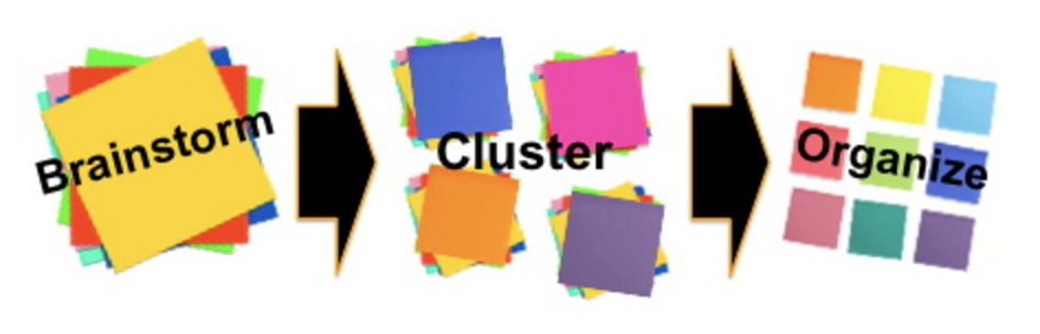
2. Make it your own – Rather than use the standard (overused) templates, consider adjusting them or creating your own. If this feels overwhelming, click over to Slideshare and roam around for a little while for some ideas and inspiration. Choose a color scheme (try www.kuler.adobe.com or www.colorhunter.com). Then choose a font set. You can choose from an abundance of fonts already on your computer just put them into your own combination. I’ve learned to use a foundation of three types. A basic font, a bold impact font and an accent font. Use the Master View to make [and save] these adjustments to your personal template.
3. Go BIG.
When you put words on your slides GO BIG. Not big $50 words but make the words you do use big. The default size in PowerPoint is not nearly big enough. A good rule to follow is nothing smaller than 32 point size and stay with about 7 words or less on the entire slide. This is usually where we figure out whether our slides are for the audience or for us [presenter crutch]. Go into the Master View and adjust the fonts bigger.

4. No Bullet Points. Yes, that’s right. No bullets points. First, bullet points are not helpful to the learner (participant, attendee). What’s happening in the brain is like what happens when you try to play an online video and you’re on a slow connection, right? You’ve probably had it happen where the video plays a bit, stops (buffering) and then plays a bit and stops (buffering), over and over again until the end.

This is sort of what happens in your brain. You can either listen or process the visuals but not both at the same time. The cognitive load (the work the brain has to do to understand) becomes too much and the whole process falters. You may have had the experience of mentally (or even physically) checking out during a cognitively heavy presentation. Bottom line, bullet points are not interesting so don’t use them.
5. Go Visual!
You’ve probably heard the old saying that a picture is worth a thousand words, right, well now we know why — Vision trumps all other senses! (Medina). Visuals communicate with the brain quicker and faster than words. Why? Our brain works a lot harder when it reads since it is actually reading each letter, clustering letters into words, and then makes meaning (cognitive load again). Recall and recognition are way better with visuals. So, look for ways to communicate your concept or ideas with visuals.
BONUS: There are lots of great resources for images, some free and some for a fee. Creative Commons licensing has helped a lot and you can find an abundance of those on Flickr https://www.flickr.com/creativecommons/. You may also want to give Wikimedia Commons at https://commons.wikimedia.org/wiki/Main_Page a try for images.
Two other really GREAT sites with no cost and no license include Unsplash (http://unsplash.com/) and Stocksnap http://stocksnap.io/.
For paid images both http://www.shutterstock.com and http://www.istockphoto.com are good resources IF you have a budget. Pay attention to the licensing to be sure the way you are using the images fits with the license. In my work the standard license fits most often.
These are five big learnings for making PowerPoint slides work better for not only me as a presenter but also for the participants.
What do you think? What have you learned along the way? Do Share.

Want more? Not sure?
Take a look at a new ebook, Break the Rules, Create Wicked Great Slide Decks for Your Workshops Trainings and Presentations that may be just what you need as a guiding tool for kicking your slides up a notch. The ebook shows you how and why to use visuals, interactivity and social media to support your participants and get your message out into the social realm.
Lorem ipsum dolor sit amet, consectetur adipiscing elit. Cras sed sapien quam. Sed dapibus est id enim facilisis, at posuere turpis adipiscing. Quisque sit amet dui dui.
Stay connected with news and updates!
Join our mailing list to receive the latest news and updates from our team.
Don't worry, your information will not be shared.
We hate SPAM. We will never sell your information, for any reason.